
` This is an interesting and creative advertisement for Berger Paints by the ad agency JWT Mumbai for their paints. The message sent by this image is quite clear; “Use Berger natural finish colors! They’re as natural as the sky!” For all those home decorators who love natural colors, this ad just screams “Buy me!”. With paint on a canvas that looks as if the painter is literally painting the sky upon it, it shows the reader how natural the paint is, that it mimics the sky. The enthymeme used here is obvious, “Natural finish colors are perfect for designer painting”, “Berger natural finish colors are so natural that it can look like the sky itself”, “Buy Berger paint!”. This ad just screams its message, and painters who see this might just go out and try this paint. Usually such ads would have the setting in the house, for decorators, but this one depicts the sky. To catch attention, usually there would be some sort of slogan, but the ingenuity of this piece requires no such slogan; it is eye-catching in and of itself. Such a beautiful illusion is sure to get customers for the company’s product, with such an unusual ad.
This is a beautiful piece by Rob Dunn, a biologist and writer at North Carolina State University in the Department of Biology, having written several books such as Every Living Thing and The Wild Life of Our Bodies. The purpose is to explain the diversity in the forms of leaves. Using beautiful relatable imagery and personification, such as “they hold out their green palms and catch light.” Dunn uses a mix of scientific and layman terms, defining the scientific terminology and in defining, uses simple words. Dunn uses inventive metaphors to spread a feeling of wonder for leaves, writing, “If there is magic in the world, surely this is it: the descendants of tiny creatures in leaves, capable of ingesting the sun.” Written for the readers of National Geographic, Dunn draws upon a cultural memory, and the context of fall to draw in readers, with “We have all held leaves, driven miles to see their fall colors, eaten them, raked them, sought their shade.” His words draw us in, dazzle us with their beauty while patiently explaining the whys of such diversity among leaves. He writes, “So leaves resort to self-defense. Some plant leaves have become specialists in deadly tricks.” and “In many environments natural selection tends to favor a limited number of similar forms again and again, given the genes it has to work with.” Mixing science and art in the form of imagery to bring his point home.
A link to this beautiful text:
http://ngm.nationalgeographic.com/2012/10/leaves/dunn-text
Inga Saffron, Harvard graduate and architecture critic of the Philadelphia Inquirer, writes about urban design issues, usually in a weekly column, “Changing Skyline”, and has done so for over a decade. One of her latest pieces, Architects' Zeal for Detail Matched Founder's, is not quite a critique of architecture as it is the unveiling of the history of the new Barnes Foundation; more specifically the challenges faced by its designers and the controversy surrounding it, as well as a sprinkle of the history of the original. Her work seems to support the move of the Barnes Foundation and its new look -Saffron speaks of the architects who designed the new foundation in a positive light, comparing them with the original designer, Albert Barnes. Using a defining device, Saffron not only explains the concept of ‘slow architecture’, but also uses it to qualify the architects, describing what they and Barnes do as “close attention to the details, etching and scoring and hammering every surface of their buildings as if they were crafting fine leather bindings or handmade paper.” This gives an air of master craftsmanship to the architect pair, as well giving them the qualification to be the designers of the new Barnes Foundation. Through imagery, comparison, and rhetorical questions, Saffron describes the design for the new building, as well as the challenges faced by the designers, such as “Where would you enter the building?” and detailing how the architects solved the problem. Saffron ends the piece describing the controversy surrounding the building and the architects, but ends with a hopeful note with a quote from Williams, one the architects of the new building.
A link to the article:
http://www.philly.com/philly/entertainment/museums/20120503_When_the_letter_arrived_in_2007_inviting_Tod_Williams_and_NO_HEAD_SPECIFIED.html?page=2&c=y
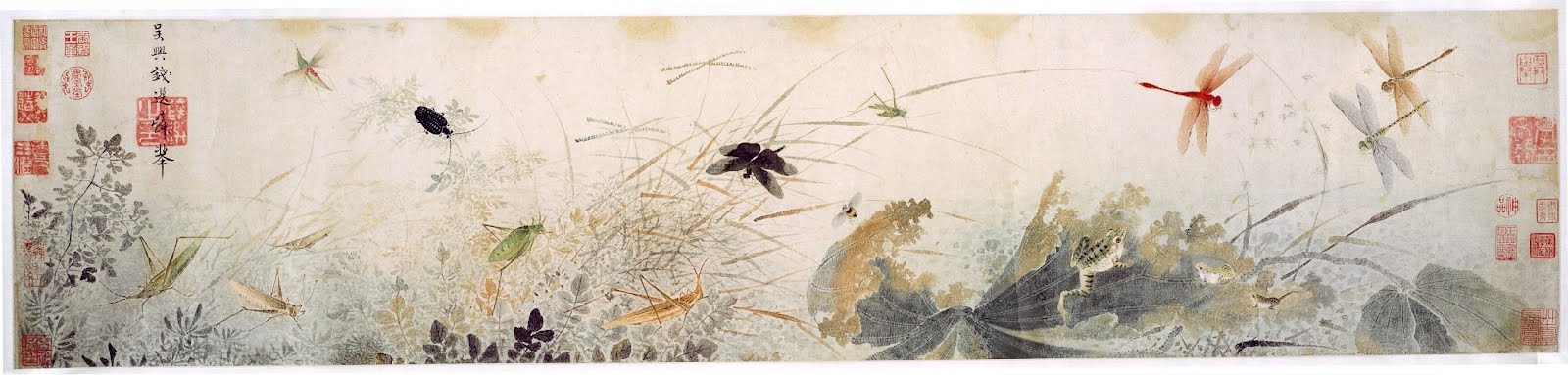
This is a beautiful Chinese water-painting of the bird-and-flower genre, though it depicts insects flying around a dying lotus. This is a painting by Qian Xuan, a painter from the late Song dynasty and early Yuan dynasty, sometime in the 13th century. The Yuan dynasty was a time when Mongols ruled China, and Xuan was a Chinese loyalist, his paintings reflecting a longing for native Chinese rule. This painting reflects his views through the decaying lotus flower and stagnant waters. Dragonflies that represent peace and harmony hover above the decaying lotus, a symbol of purity and beauty, but here is representing China under Mongolian rule. This painting is for viewing pleasure, and not many would have seen it in the painter’s time. This painting was most likely a lament for Xuan himself, and his close friends, then a public painting. The symbology of the painting is something that would have been understood by the people of the time, in their culture. I believe that the painter accomplished his goal to portray his views on Mongolian rule through a beautiful water-painting, using the decaying lotus, but I feel that in modern times, where not many understand the culture nor background of this painting, the message is missed.
This painting is currently displayed at the Detroit Institute of Arts