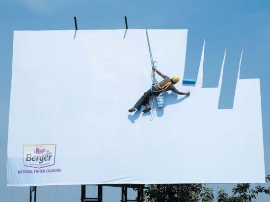
` This is an interesting and creative advertisement for Berger Paints by the ad agency JWT Mumbai for their paints. The message sent by this image is quite clear; “Use Berger natural finish colors! They’re as natural as the sky!” For all those home decorators who love natural colors, this ad just screams “Buy me!”. With paint on a canvas that looks as if the painter is literally painting the sky upon it, it shows the reader how natural the paint is, that it mimics the sky. The enthymeme used here is obvious, “Natural finish colors are perfect for designer painting”, “Berger natural finish colors are so natural that it can look like the sky itself”, “Buy Berger paint!”. This ad just screams its message, and painters who see this might just go out and try this paint. Usually such ads would have the setting in the house, for decorators, but this one depicts the sky. To catch attention, usually there would be some sort of slogan, but the ingenuity of this piece requires no such slogan; it is eye-catching in and of itself. Such a beautiful illusion is sure to get customers for the company’s product, with such an unusual ad.